Showing posts with label Colouring. Show all posts

Sunday, 26 October 2014

BATMAN - I AM THE NIGHT 75th Anniversary Artwork Print


Batman 75th Anniversary Print.
"I am the night and sometimes the very, very, very late afternoon"

Sketch Idea 1a
Sketch Idea 1b
Painted Art
Line Art
City Scape - Grunge Painting
Text (Black & White Bitmap)
Digital Colour Progression
FINAL ART


Best wishes
...
Damian K. Sheiles

Tuesday, 29 July 2014

New Artwork Show & Tell

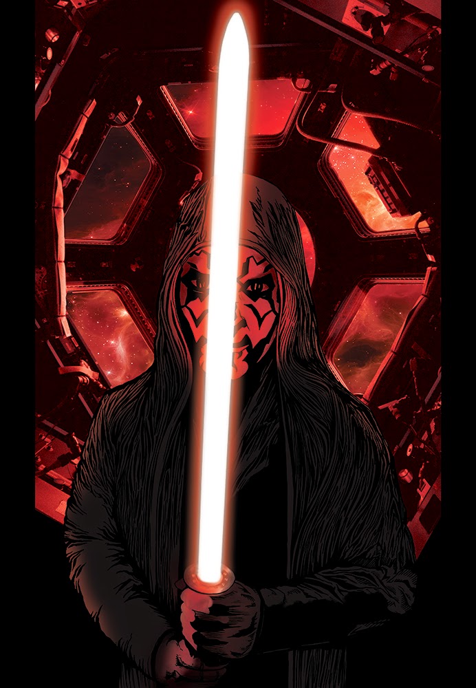
Have you or a friend ever wanted to have your likeness drawn as a Jedi or Sith Lord? Well now's your chance to impress that special someone in your life.


I am now taking orders for Star Wars Commissions based on the likeness of a supplied or taken photo. If you're in Perth, I'll arrange the photo shoot with props. If not, I'll require you to send me a hi-res photo of the person in the correct pose for the character to be illustrated. 

Priced at;
$150 A4 Colour Hi-res file and art print*
$250 A3 Colour Hi-res file and art print*

Here's a sample of how the finished artwork will look.


Send me message via this blog or email - design@dks.net.au to arrange your commission.

* Turnaround time 2 - 3 weeks.

Best wishes
...
Damian K. Sheiles

Wednesday, 28 May 2014

DKSid - META Progress

Tonight's blog post will be short and sweet. Last March I provided a sneak peak at DKSid, a small publication I am working on with the intention to showcase my illustrative design skills to the IDW lads at Perth Supanova this June.

Further progress has been made this week. Here's another preview of some pages.

META - page 1 pencil rough
META - page 1 without text
META - page 1 complete with text


META - page 4 illustration (ink)

META - page 4 without text

Best wishes
...
Damian K. Sheiles

Wednesday, 5 March 2014

Lady Tron wants to fight you on the Grid!

I simply love the design of Tron. It's such a fun environment to work in so it was with much relish and enthusiasm that I created the following piece of art: Ladytron - Bring on the Disk Wars!

For those that don't know, Ladytron is a comic character created by comics mage, Alan Moore along with artists extraordinaire Travis Charest in the pages of Wildstorm's Wildcats comic book series. Ladytron is an angst driven, anarchic, narcissistic cyborg with a criminal past and a perfect candidate to fight it out on the grid. For the purpose of this amalgam piece of art, I wanted to play up the Tron aspect of the character's name so I developed a little logo for Lady TRON.

Lady TRON logo
I started out with an initial character sketch (pencil on A4 paper) to work out the pose and over all design of the figure. With Lady Tron, I went through 4 revisions before getting the pose and design to work, adding more detail as I went from version to version.
Revision 4 sketch

Version 4 colour
I created a blue line version of the above sketch which I inked, scanned and coloured in Photoshop. It was at this stage that I realised the character was way too masculine and that the arms weren't quite working as I'd hoped. As I had already done a LOT of work in Photoshop to get the figure to this level of finished art, I decided that the quickest way to continue was to draw 'head' and 'arm' patches (see below) to fix up the artwork.


These were integrated with the original black and white line art and then coloured and added to the work-in-progress figure. This saved me having to go back to the drawing board and re-doing the figure from scratch, saving me a ton of time. This is where computers come in real handy.
Final art for Lady Tron character
I already had some environments in development for the world of Tron as I'd previously developed a TRON: Uprising Paige piece and was also working on some Batman / Catwoman / Tron amalgam pieces in tandem. There's also a reason why Lady Tron's right leg is cocked up, she's standing on a derezzed games program. This was sketched and inked, then coloured in Photoshop with the derezzed pixels being composited using Adobe Illustrator. Fun, fun, fun.

Derezzed Games Program - taken out by Lady Tron.
Background image sans characters
Final composite artwork. Lady Tron Disk Wars

Alternate version

...
Damian K. Sheiles


Tuesday, 22 October 2013

It's a Swamp Thing baby!

Here's another look at my art process that combines traditional ink and water colour paint with digital finishing processes. I quite enjoy both aspects of creating art this way - it's nice to work with tangible materials and then touch-up and finish using the computer.

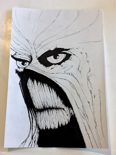
This was for OzComics Facebook Draw-Off challenge. The topic being DC / Vertigo Comics - Swamp Thing. I'm a fan of the character and have read many of the comic series over the last 20 years starting with the much praised Alan Moore, Steve Bissette and John Totleben run so I was already quite familiar with the character and had an idea in mind as to how I would create my illustration for the Draw-Off challenge. Having said that, a little research always helps, so I conducted a Google image search for inspiration, direction and reference. The following artists impressions of the character would inform my illustration.

Reference imagery


The finished inked piece.

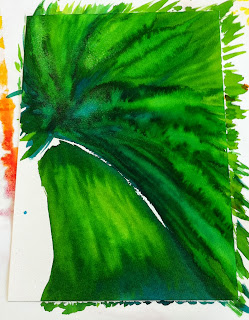
The finished water colour inks.

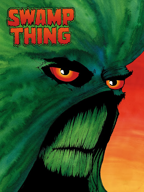
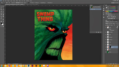
The end result. Final art composited in Photoshop

Here's a brief look at my digital colour process in 10 steps.

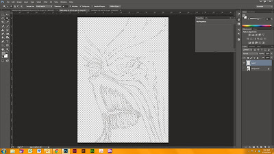
Step 1. Scan the artwork as a Black and White bitmap at 600dpi. This way you end up with a hi-res, very sharp, pure black and white image.

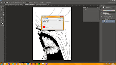
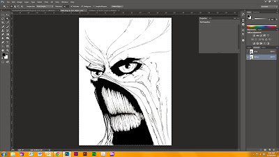
Step 2. Convert image to Grayscale (you can down-size to 300dpi if you like to work on smaller files but leaving it at 450 - 600dpi tends to be industry standard).  With the background layer selected (main artwork layer) > COPY ALL.  Create a new ALPHA Channel (see palette window RHS column). 
Step 3. Paste the artwork into the ALPHA channel. It should look exactly like the black and white line art.

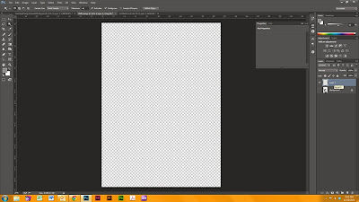
Step 4. Create a new transparent LAYER and turn the background layer OFF so you can see the transparency grid.

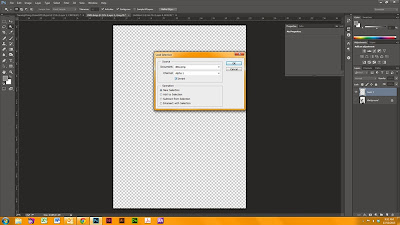
Step 5. With the new layer selected, go to SELECT drop down menu, select LOAD SELECTION.  Under the CHANNEL drop down menu select ALPHA and tick the INVERT check box.

Step 6. You should now see the 'marching ants' selection like the above.

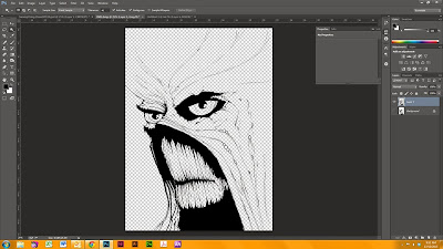
Step 7. FILL this selection with the default (rich) black Photoshop colour swatch. You will now have solid black line art with a transparent background that you can add colour to underneath.

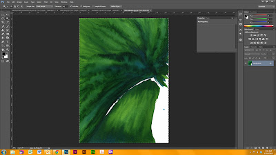
Step 8. Scan the water colour ink wash into Photoshop as a hi-res JPEG (match the resolution to be the same as the scanned Black and White line art you are working on). SELECT ALL and COPY the colour art.

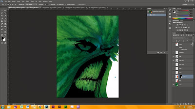
Step 9. PASTE the colour art into a layer underneath the black line art. You'll notice at this stage I flipped the artwork horizontally as I wanted it to 'read' left-to-right.

Step 10. Clean up artwork, add detail, extra graphics and background as desired. 

I matched the background colour to Swamp Thing's eyes as this keeps the colour palette simple and helps the foreground image stand out. I find the best way to work is by using individual layers for each artifact. In the example above, the eyes, logo, line art and background colour all have separate layers - I rename my layers to be what they are as this makes identification much easier when working on PSDs that have lots of layers. Editing, tweaking and experimenting is a breeze with multiple layers and much faster too.

The red sky was recycled from another illustration - I find that it's good to have a library of textures and ink washes to use in my illustration work as that speeds up the process and gives the finished art a more organic feel. As a side note, the above illustration from start to finish took about 4 hours to complete.

...

Damian K Sheiles.

Thursday, 6 October 2011

Digital Colouring Using Photoshop - Zatanna Pin-up

A couple of years ago I flirted with the idea of becoming a comic book colourist as a means of earning money on the side and to gain further insight in to the comic book publishing industry.

I purchased the DC Comics Guide to Coloring http://www.bookdepository.co.uk/DC-Comics-Guide-Coloring-Lettering-Comics-Mark-Chiarello/9780823010301 from Book Depository to gain an understanding of the process DC Comics employ. I found this book to also be a great refresher for colour theory and applied a lot of this knowledge to my graphic design work.

For today's blog entry, I'm going to show you 6 fast steps of the Photoshop colouring process that I use when digitally colouring comic art for fun!

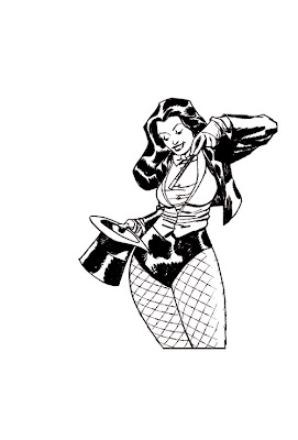
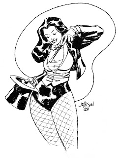
First up is the scan of the original art I purchased from Dave Johnson at Supanova Perth 2011.

Original Zatanna art - Dave Johnson
This original piece of art by Dave Johnson is simply stunning. The composition is perfect. Take note of how the eye is lead from the top right shoulder of the figure down to the hand holding the magic wand pointing at the top hat. The jacket on the right side cuts into the negative space, the hair on the left counter balances the jacket. The directional lines in this figure are dynamically realised by a professional illustrator so I didn't want to alter too much of the line work in Dave's original drawing - it's all there to begin with so why mess with perfection.

My Photoshop Colouring Process in 6 fast steps.

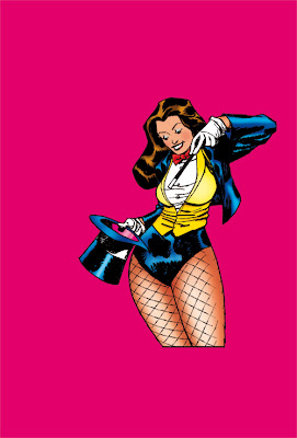
1. I edit the line drawing so it's easier to lay in the flat colour. You'll notice that I have removed the swirling border line drawn a horizontal line to close off the legs at the bottom. I also removed Dave's signature which I'll add again later.

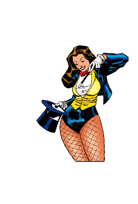
2. I lay in flat colour for the figure only. Creating a separate layer for each element which enables me to have control over each area should I choose to change the colour or add additional modeling techniques. The above image already shows some figure shading.

3. At this step of the process, I have completed the figure modelling completing highlights and shadows.

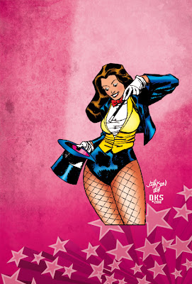
4. I add background colour . I find that having the background solid colour on it's own layer makes it very easy to change and find what colour will work best for the final composition. For example I can change the background colour to blue or red and this will have a uniform affect on the entire piece. It is important to note what the background colour or environment will be as this may affect some of the lighting/colouring choices that you will make.

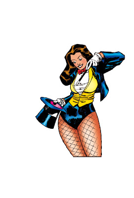
5. I experiment by bringing in different textured backgrounds to give the piece a sense of depth.  I add a light source to lead the viewers eye to the figure's face and upper body. I also add 3D stars to the bottom right to act as additional leading lines towards the figure's legs. You will also note that I have included the original artists signature along with my digital signature to the background. I would never take credit for something that I didn't draw.

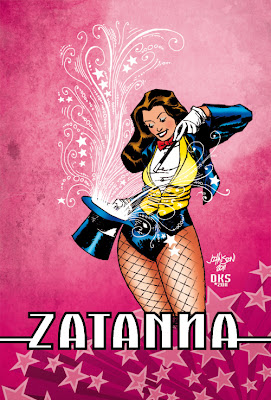
6. To finish off, I add some 'prestige' to the final composition by scanning in hand drawn swirls to emanate from the top hat. I also add the "Zatanna" logotype to mask the legs at the bottom. The logotype was created using Adobe Illustrator. Take note of the inverted N design element working to bring the logotype and figure together to form a cohesive design.
We now have the finished digitally coloured piece. This was done for my personal amusement only and took about 3 hours to complete. I have a hard copy print of the final coloured work that I proudly display with the original art by Dave Johnson in my original comic art portfolio collection.

My original comic art collection can be see online here http://www.comicartfans.com/GalleryDetail.asp?GCat=51215

Best wishes,

Damian :)