Showing posts with label Comics. Show all posts

Sunday, 26 October 2014

BATMAN - I AM THE NIGHT 75th Anniversary Artwork Print


Batman 75th Anniversary Print.
"I am the night and sometimes the very, very, very late afternoon"

Sketch Idea 1a
Sketch Idea 1b
Painted Art
Line Art
City Scape - Grunge Painting
Text (Black & White Bitmap)
Digital Colour Progression
FINAL ART


Best wishes
...
Damian K. Sheiles

Sunday, 25 May 2014

Pop Culture, Film & Comics Amalgamate! (part 1)

Wow - it's been a whole month since my last blog post.

When I started this blog, it was my intention to post once every week or four times a month on average. To make up for my lack of posts recently, I'm going to post an art process blog entry every day of this week.

This year I have been creating more art than I have in the last 12 years combined. I have been reacquainting myself with concept, process, technique and execution. At the forefront of all creativity is inspiration or a passionate curiosity to explore ideas in any medium. Earlier I was working on Batman / Tron hybrid artwork designs which also lead to a Ladytron (Wildcats) piece as well. I like the idea of amalgamating 2 franchises or film concepts with comic universes. The results can at once be rewarding and delightfully obvious.

With the above in mind I now present; 30 Dark Days of the Knight.


I was conceptualising a series of poster designs that fused film poster design with comic franchises. The first idea I had was combining characters from the world of Superman with the poster design of Fritz Lang's 1927 film, Metropolis. I'll post a blog about this work later in the week.

Getting back to 30 Dark Days of the Knight; By studying poster designs for both 30 Days of Night and Batman Begins, I was set to create my amalgam tribute piece.


I had already determined that the size I wanted for these particular poster designs was going to be long portrait style, proportionate to half of an A3 page length-ways so my sketches were produced to scale to ensure the design elements would work together (see sketch below on the left). I wanted the poster title treatment to be very similar to the style on the official poster, but I didn't want it to be exactly the same so I added some variation and also distorted '30' a little more and included some extra 'splatter' here and there.


The Batman head sketch evolved from initial thumbnail sketch (above) to actual size rough which was then refined a few time before it was ready to be inked and digitally coloured. The images below show the character/detail evolution for the vampire inspired Batman character element.


Now that the title and main character had been established, I required some paint splatter marks and a lot of bats. The following images are some of the splatters and the bat colony that were used in the final poster design.


With all the art and design elements now ready for layout composition, the poster was completed using InDesign. One of the many benefits of using InDesign as my main tool to composite poster design (rather than Photoshop) is the ease of which colour can be edited/changed as well as being able to work on duplicate versions in tandem in the same document. I also prefer InDesign for ease-of-use text editing to PhotoShop.

Here's the 2 final versions. Design B has a photo of The Peak View at Hong Kong superimposed above the title treatment. The photo was taken whilst travelling in Hong Kong many years ago. I ran it through some filters and colour shift so that it worked within context of the design. I also set the over all colour theme to be blue as opposed to red as this further removed it from being too similar to the official 30 Days of Night poster design. Plus cool blue works so nicely with the theme and provides contrast against the white teeth and flesh of the Vampire Batman characters face.

Final Poster Design A
Final Poster Design B
The Peak Hong Kong photo by Melinda Kinnane - edit DKS
I hoped you enjoyed this look at the evolution of my 30 Dark Days of the Knight poster design and I hope you're back to see the evolution of Metropolis Pictures presents Superman in The City of the City of Tomorrow. You can follow me on Facebook too if that's your thing.

Best wishes
...
Damian K. Sheiles

Thursday, 27 February 2014

The Sandman water colour painting or getting familiar with brushes again

Here's a sequence of warm up sketches and paintings of The Sandman, the lead character from the DC/Vertigo comic series of the same name.

I have been familiarising myself with different art mediums, trying to get a handle on the process all over again. I'm finding an appreciation for water colour inks I never had before. There's something about the way you can build up colour and the translucent affect the paper can have through the paint as seen in the water colour fire detail below (see the last image - scroll down =)


Preliminary sketch
Inked value sketch
Water Colour Test 1
Water Colour Test 2
water colour detail
...
Damian K. Sheiles

Tuesday, 31 December 2013

My Top Comic Reads for 2013

It's that time of year again where we reflect on what we liked throughout the year. All the top "....." lists are surfacing on the net so I thought I'd throw my highlights into the mix as well. My top comic or comic related reads for 2013, in no particular order, are as follows;


Strange Attractors by Charles Soule and Greg Scott.


The City is an Engine. Heller Wilson has found the key. From acclaimed writer Charles Soule (27, Strongman, Swamp Thing) comes a mathematical thriller about Chaos, Probability, and the race to stop a citywide disaster. In 1978, Dr. Spencer Brownfield saved New York City from itself, bringing the city back from the verge of collapse and ruin. And for thirty years, his small, unnoticed adjustments to the city's systems have kept the city afloat. Or so he claims to Heller Wilson, a young graduate student that Dr. Brownfield has chosen as his successor. But are Dr. Brownfield's claims about The Butterfly Effect and how his "complexity math" apply to the city's patterns of life real, or are they the ravings of a man broken by the death of his wife and daughter, desperate to find some kind of control over the world around him? Part sci-fi, part philosophical exploration, part thriller, Strange Attractors examines what you can control in your life and what you can't, and how important it is to recognize the difference.


The Nao of Brown by Glyn Dillon


Nao Brown is 'Hafu': half Japanese, half English. She suffers with OCD, but not the hand-washing, overly tidy type that people joke about. Nao suffers from violent morbid obsessions and a racing, unruly mind. She works part time in a 'designer' vinyl toy shop, whilst struggling to get her own design and illustration career off the ground. She's looking for love - the perfect love. But in meeting the man of her dreams, she realises that - dreams can be quite weird. Nao meditates in an attempt to quieten her mind and open her heart and it's through this that she comes to realise that things aren't so black and white after all. In fact, they're much more...brown.


The Sandman Overture #1 by Neil Gaiman & J H Williams III


Batwoman: Worlds Finest (Vol 3 Hardcover) by J H Williams III, W Haden Blackman and Trevor McCarthy.


Batwoman's search for Medusa brings her together with the Amazing Amazon, Wonder Woman, but even the teaming of the World's Finest might not be enough to bring down the mythological monster - leading Bones, the DEO, Abbot and the Religion of Crime to all descend on Gotham City to take part in the fight.


Locke and Key by Joe Hill & Gabriel Rodriguez


... tells of Keyhouse, an unlikely New England mansion, with fantastic doors that transform all who dare to walk through them...and home to a hate-filled and relentless creature that will not rest until it forces open the most terrible door of them all...! Acclaimed suspense novelist and "New York Times" best-selling author Joe Hill creates an all-new story of dark fantasy and wonder, with astounding artwork from Gabriel Rodriguez.


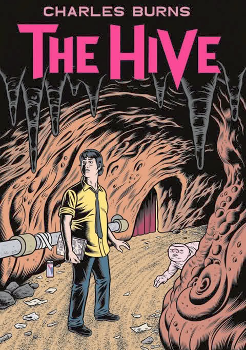
X'ed Out and The Hive by Charles Burns


X'ed Out: Meet Doug, aspiring young artist. He's having a strange night. A weird buzzing noise on the other side of the wall has woken him up, and there across the room, next to a huge hole torn out of the bricks, sits his beloved cat Inky. Who died years ago. But that's no longer the case, as he slinks through the hole, beckoning Doug to follow. So he does. Now there's no turning back. What the heck is going on? To say much more would spoil the creepy, Burnsian fun, especially since - unlike Black Hole - X'ed Out has not been previously serialised anywhere and will have readers guessing at every unnervingly meticulous panel. Drawing inspiration from such diverse influences as Herge and William Burroughs, X'ed Out is an engrossing new comic book fever-dream, from a true master of the form at the height of his powers.


The Hive: Doug is still in the netherworld. He's working a cleaning job in the Hive's stinking hallways, trying to ignore the screams, and reading romance comics to the breeders. But as the stories unravel on the page, frame by frame, mirrored memories plunge him back into his waking life. And that's where the real nightmare is. In Burns' trademark hard-edged style, "The Hive" is horrifying and completely absorbing: an incredible new installment from one of the most exciting artists in the comic's world.
...

Well there you have it. For me 2013 was all about independent comics making a huge impact on the scene. The majority of output from DC Comics and Marvel has left me cold of late.

Damian K. Sheiles