Thursday, 31 October 2013

Breaking Bad Poster Design - Breaking Down My Process

I consider Breaking Bad to be the best show to ever grace our TV screens. All involved with the show gave it their all from beginning to end. There were no half measures taken in the making of this show - the quality of script, acting, production and originality of ideas that filtered through the show continually kept audiences intrigued throughout the entire series. Just when you thought you knew what a character was going to do next, you'd be left gasping as the unexpected occurred again and again.

When JB Hi Fi announced a poster competition to commemorate the release of the final season on DVD and Blu-ray, it was with the same amount of passion that I took to designing some poster concepts. I spent about 3 days total working up designs and utilised a Facebook Draw-Off competition  (see blog post here) as a warm up exercise, illustrating Walter White and to test some paint treatments that would be used in my poster designs.

The brief from the promoter was quite concise. I reviewed it several times to ensure that my work would remain within scope. An excert from the T&C is posted below for your easy reference;

TO BE ELIGIBLE FOR CONSIDERATION, EACH SUBMISSION MUST MEET ALL OF THE FOLLOWING CRITERIA:
a) The Poster must be the original work of the entrant, using the assets provided by the Promoter (which includes title treatment, approved key artwork, approved images);
b) The Poster must include the “Breaking Bad” title treatment as supplied;
c) The Poster must include the words “The Final Season”;
d) The Poster must clearly represent the “Breaking Bad” television series;
e) The Poster must not portray illicit/illegal drugs, drugs paraphernalia or actual drug use;
f) If the entrant’s Poster features any characters from “Breaking Bad” as featured in any supplied images, an image of Walter White (Bryan Cranston) from those supplied must also appear;
g) The Poster for Submission must be 685mm (wide) x 1010mm (high), CMYK, portrait orientation;
h) The Poster must be submitted as a flat JPEG image with a maximum file size of 2MB; and
i) The Winner must be able to submit high resolution (300dpi) artwork for printing.

The full T&C's for this competition can be read here.

After I had reviewed the scope of the competition and conditions of entry, I then set out to review the assets that were provided to entrants as outlined in points a) and b) above. I worked up a handful of quick thumbnail sketches keeping in mind the photos I had to work with and also to act as a guide as to what photos/imagery I would need to source and develop to compliment my poster designs.
Thumbnail sketches for poster design
As the deadline for this competition fell after the air date of the final Breaking Bad episode, I decided that I would use the available time to develop poster design ideas and then revise my preferred designs after I had watched the final episode. This way I'd know how it all ended and I would have the big finale in mind to better convey the feel of the final season from a design aesthetic and marketable point of view. Plus I also didn't want to accidentally give away any key plot points to anyone that was waiting for the DVD / Blu-ray release to watch the final episodes.

The main theme that ran through this show was to my mind, being bad with clever science or the properties of change or even the changing state of decay. All brilliant poster design utilises a combination of 'hero' or main imagery PLUS the clever use of typography to convey the hook or headline to the intended audience. All poster and billboard design does this. It may be one simple image and a handful of words. Sometimes that's all it needs to be. That is the 'science' of great poster and billboard advertising. The themes or headlines that I developed to work with were as follows;

1. Balance the Equation
2. Every End Has A Start
3. All My Dreams Torn Asunder
4. Every Action Has An Equal And Opposite Reaction
5. Suffer The Consequences
6. The King is Dead - Long Live the King

In total I spent somewhere close to 25 hours working on my poster design concepts. It was most definitely a labour of love and swan song to a show I hold so very dear. I produced nearly 40 poster designs and concepts but realised that these needed to be culled down to a manageable quantity so that I could focus my time on a handful of designs that I felt worked best.

The judging criteria for this design competition was a very simple and clear formula;
------------------------------------
JUDGING
A. First Round: Eligible Submissions received will be judged starting on or about 20th October 2013 by Promoter and representatives of JB Hi-Fi and/or Stack Magazine (“First Round Judges”), who will select at least eleven (11) finalists (“Finalists”), based upon the following criteria:

a) Marketability – 10 points;
b) Creativity – 10 points;
c) Originality – 10 points; and
d) Effective use of content – 10 points
(40 points maximum)

The eleven (11) entrants whose Submissions receive the highest point totals will be declared Finalists, and will have their Submissions entered into the Final Round Judging, subject to verification of eligibility. Promoter has the right, in its sole discretion, to select fewer than ten (11) Finalists based on insufficient number of eligible Entries/Submissions received. In the event of a tie to determine a Finalist, the tied entrant who submitted the Submission with the higher score in “Marketability” will be declared a potential Finalist. In the event of a further tie, the tied entrant who submitted the Submission with the higher score in “Creativity” will be declared a potential Finalist. Any further ties will be broken by the points earned by remaining tied entrants respectively in each of the following categories, in order, as necessary: “Originality” and “Effective use of content provided by Promoter”. If needed, the First Round Judges will re-score Submissions until any tie(s) is/are broken.
------------------------------------
The above states that Marketability is the most important criterion followed by Creativity, Originality and then followed by Effective Use of Content (promoter supplied assets). It was with this in mind that I produced the following 15 Final Poster Design submissions from my initial design concepts.

Design 1. Straight Up Character Poster with Headline. We have the rival families 'divided' by Jesse Pinkman.
Design 2. Straight Up Character Poster with Headline. Same as above but with different colour/text treatment.

Design 3. Characters in Silhouette against a setting sun with headline. In this version, I've changed the natural red colour scheme to the trademark Breaking Bad green. I quite like this design. The characters being in silhouette convey a sense that no one is safe in the final episodes. As the sun sets on our cast of characters so does it set on the final season of Breaking Bad.
Design 4. Characters in Silhouette against a setting sun with headline. The characters being in silhouette convey a sense that  no one is safe in the final episodes. As the sun sets on our cast of characters so does it set on the final season of Breaking Bad. Note the placement of Heisenberg's hat on the cactus next to Walter White. This was to serve as a visual cue as to who this character is in the poster design plus it acts as a nod to Walter White wanting to retire the Heisenberg role so that he may reunite his family.

Design 5. This poster design places Jesse and Walt's relationship front and centre in an attempt to convey what is going on between these two characters during the final season. Jesse fears Walt and what he may do to him, whereas Walt is concerned about Jesse's intent and what he may do with the knowledge he has. Walt feels tremendous responsibility to this young man and in many ways is much closer to Jesse than he is to his own son. It's up to Walter to put things right and balance the equation before all is said and done.

Design 6. The main theme for this design is Skyler looking at Walt to see if there's any semblance of the man left that she used to know but still loves. Walt, as usual, is looking away from his family to what he thinks he 'needs' to do for his them. The headline reads "All My Dreams Torn Asunder" but whose dreams does it refer to?
Design 7. The King Is Dead - Long Live The King.
Design 8. The King Is Dead - Long Live The King. Alternate version without the Heisenberg hat. I felt that this concept was a bit risky as it says that the King is Dead which when taken literally announces that Walter White is dead. Everyone that followed the show always knew that the series was going to end with the death of Walter White - the tantalising question was - how is he going to die?
Design 9. Straight up hero image with headline. This is an early final season promo photo that includes Mike. I thought this was a nice touch and works if this design is used for the entire final season and not just the final 8 episodes. This is one of my favourite designs but probably not appropriate for this design competition.
Design 10. Walter White hero image with paint splatter treatment and headline. The composition of this poster is good. The colour scheme however is not appropriate for the final season which has a very dark tone running throughout. This would work much better if the blue sky was a dark sky with setting sun.
Design 11. Simple design and message but has the same problem as the poster design above it. Needs to be darker/more gritty and inline with the feel of those final 8 episodes. 
Design 12. Long Live The King.

Design 13. Long Live The King - Heisenberg version.

Design 14. All My Dreams Torn Asunder - Walter White decaying/fading image that symbolises the way he loses control of many situations in the episodes leading up to the finale. His mind is succumbing to the presure and recurring cancer and the greedy hounds of war he's let loose in the form of the white supremacists gang.
Design 15. A split image of Walter White from the first and last seasons of the show - a symbolic gesture of the transformation of Walter White into Heisenberg. 
I can see now that some of these designs (1, 2, 6, 10 and 11) don't quite hit the mark or reflect that dark tone that was prevalent throughout the last season of Breaking Bad but I thought that some of these designs were fairly strong.

None of my designs were selected by the judging panel to make the finalists selection. I guess they just weren't what the judges were looking for in this instance and that's how it goes when entering a design based competition. Here's a link to the winning design and 10 finalists.

I'd love to know what Vince Gilligan would have thought of my designs if he had seen them but I guess I'll never know. As always your thoughts and comments are most welcome.

Damian K. Sheiles 


Tuesday, 22 October 2013

It's a Swamp Thing baby!

Here's another look at my art process that combines traditional ink and water colour paint with digital finishing processes. I quite enjoy both aspects of creating art this way - it's nice to work with tangible materials and then touch-up and finish using the computer.

This was for OzComics Facebook Draw-Off challenge. The topic being DC / Vertigo Comics - Swamp Thing. I'm a fan of the character and have read many of the comic series over the last 20 years starting with the much praised Alan Moore, Steve Bissette and John Totleben run so I was already quite familiar with the character and had an idea in mind as to how I would create my illustration for the Draw-Off challenge. Having said that, a little research always helps, so I conducted a Google image search for inspiration, direction and reference. The following artists impressions of the character would inform my illustration.

Reference imagery


The finished inked piece.

The finished water colour inks.

The end result. Final art composited in Photoshop

Here's a brief look at my digital colour process in 10 steps.

Step 1. Scan the artwork as a Black and White bitmap at 600dpi. This way you end up with a hi-res, very sharp, pure black and white image.

Step 2. Convert image to Grayscale (you can down-size to 300dpi if you like to work on smaller files but leaving it at 450 - 600dpi tends to be industry standard).  With the background layer selected (main artwork layer) > COPY ALL.  Create a new ALPHA Channel (see palette window RHS column). 

Step 3. Paste the artwork into the ALPHA channel. It should look exactly like the black and white line art.

Step 4. Create a new transparent LAYER and turn the background layer OFF so you can see the transparency grid.

Step 5. With the new layer selected, go to SELECT drop down menu, select LOAD SELECTION.  Under the CHANNEL drop down menu select ALPHA and tick the INVERT check box.

Step 6. You should now see the 'marching ants' selection like the above.

Step 7. FILL this selection with the default (rich) black Photoshop colour swatch. You will now have solid black line art with a transparent background that you can add colour to underneath.

Step 8. Scan the water colour ink wash into Photoshop as a hi-res JPEG (match the resolution to be the same as the scanned Black and White line art you are working on). SELECT ALL and COPY the colour art.

Step 9. PASTE the colour art into a layer underneath the black line art. You'll notice at this stage I flipped the artwork horizontally as I wanted it to 'read' left-to-right.

Step 10. Clean up artwork, add detail, extra graphics and background as desired. 

I matched the background colour to Swamp Thing's eyes as this keeps the colour palette simple and helps the foreground image stand out. I find the best way to work is by using individual layers for each artifact. In the example above, the eyes, logo, line art and background colour all have separate layers - I rename my layers to be what they are as this makes identification much easier when working on PSDs that have lots of layers. Editing, tweaking and experimenting is a breeze with multiple layers and much faster too.

The red sky was recycled from another illustration - I find that it's good to have a library of textures and ink washes to use in my illustration work as that speeds up the process and gives the finished art a more organic feel. As a side note, the above illustration from start to finish took about 4 hours to complete.

...

Damian K Sheiles.

Tuesday, 15 October 2013

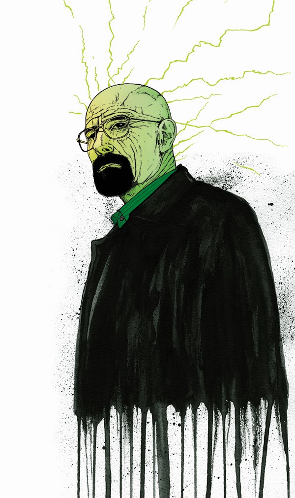
Breaking Art > The process behind my Walter White Illustration

Every week on Facebook, OzComics has a no-prize draw-off competition. To commemorate the series finale of TV's Breaking Bad, the draw-off competition for that week was, you guessed it, any character from Breaking Bad.

Breaking Bad to me is the the best show to ever grace our TV screens, the portrayal of Walter White by Bryan Cranston (a favourite actor of mine from his 7 years on Malcolm in the Middle) hit very close to the bone and I found myself often sympathising with his situation even long after I 'knew' I shouldn't be.

I decided that I would honour the show and Bryan Cranston in particular by producing an illustration of his character Walter White. The photos below showcase my art process from reference material, painting the jacket, applying water drips and ink splatters to scanning the art and digitising in Photoshop.

I hope you dig it!

My first attempt at the painted jacket with splatters and dripping ink run-off. The jacket on the right is the start of the second attempt with stronger focus on jacket shape, contour and shading. The final jacket will be scanned into Photoshop as a grayscale image at 300dpi.

The jacket was scanned into the computer at 2 different times. The above scan was after I had completed the initial painting stage - before the ink splatters and water drips were applied to the finished art.

Here's the above painted jacket complete with ink splatters and water drip run-off.

Light pencil sketch of Walter White  (head & shoulders).
The above image shows the pencil sketch with minimal ink added, filling in the detail and adding depth to the face and neck. The final ink drawing (below) will be scanned in to Photoshop as a Black & White bitmap at 600dpi.
Completed inked version of Walter White (head & shoulders).
I scanned the head and the printed the black/white at a much smaller size so I could draw the lightning though lines emanating from the creases on Walter's facial skin. This would serve as a graphic element and directional tool in the final composition.

Walter White - digitised and coloured in Photoshop.

Composite coloured background featuring various stock photo antique paper textures and custom fractal image developed using Apophysis.
Raw fractal image as rendered with Apophysis. Green filter applied in Photoshop.

FINAL ART

FINAL ART with logo and title treatment.
...

Damian K. Sheiles

Saturday, 12 November 2011

About My New Recording, LP2


The concept for LP2 (Long Play 2) was realised earlier this year after I had recorded enough new material to complete a full length album.

I've always been intrigued with space themed art, stars-capes and a sense of other incredible unreachable worlds. An overall image of how I wanted to present this new body of work began to take shape - to tie all the songs together with a common otherworldly theme. LP2 as a cohesive whole began to form aesthetically. LP2, however, is not a concept album - there is no larger story to be found here other than a reoccurring theme of 'other' worlds, alternate realities and differing states of mind.

I spent a large part of my teenage years lying on the floor of my room and listening to albums from start to finish through headphones. I believed that the artist's greater message could only be discovered if their music was absorbed in whole and not 'single' parts. These days, full length albums are rarely listened to in their entirety - only the devoted fans devour albums by their favourite artist's as a full course meal consumed in one sitting. LP2 is a 16 track long play recording - it's a smorgasbord of songs, diversity of styles and contrasting sound-scapes. In its entirety, it clocks in at approx 76 minutes. By today's standards, it is a long album so the FREE digital release has been culled back to 14 tracks - total time: approx 67 minutes.

A handful of the songs that debut on LP2 had been lying around since 2007/08 (
11:11, Empire Fire Town, Adrift and The New Division) simply waiting to be shared. Other songs had been coagulating for quite some time (Optimystic and Stardust originally conceived in 1992). The song Chasing Dragons was written mere months ago while the remains of the album was written and recorded earlier this year (CrossRoad, Pulse, The Space Station Mystery, You Are A Winter Storm and Tunnel).

Download LP2 for free from my website - www.dks.net.au/music

What do the songs on LP2 mean and how did they come to be?
It could be misconstrued that all these songs are about me when in fact none of them are. As you listen, you will hear my musical influences come though. Try as I might, it’s hard not to show any influences in the music I make. Sometimes it’s a tribute to bands that have shaped my style with my own personal spin on the final sound with the end result, hopefully, being something unique.

Empire Fire Town. The lyrics for this song were written rather quickly to accompany the music I had already demoed. It's a simple song commenting on nostalgia for how things used to be and how places don't really change but we do.

CrossRoad. This song takes its name from the film "The Road" and the graphic novel "Crossed" (written by Garth Ennis published by Avatar Press) taking themes from both, informing the lyrics and tone of song.

Chasing Dragons. Was originally titled “Want It, Need It” and was going to be about the trappings of consumerism. It ended up being about drug. The new song title, Chasing Dragons, is taken from the slang reference to Opium Dens and their patrons being known to 'chase the dragon'. Some of the lyrical imagery was inspired by the graphic novel "The League of Extraordinary Gentlemen Volume 1" written by Alan Moore, illustrated by Kevin O'neiil.

The New Division. Is an instrumental tribute to the bands Joy Division and New Order. The song’s title is an obvious mash-up of the two band’s names.

Optimystic I & II. Optimystic II is a reinterpretation of an instrumental song I originally came up with about 18 years ago. Optimystic II has been played once live at my August CD launch in 2008. Optimystic I is closer to the original instrumental version. It was always intended to be an instrumental song but when I developed graphics to promote each individual song and the visual theme of Optimystic presented itself to me, this informed the lyrics that I wrote for Melinda to perform on the song. Song informing art > informing lyrics > informing song.

Promotional image for Optimystic I
 
Pulse. Ok, you got me here. This is the only song on the album that is about me and my state of mind at times. We all question our paths and choices and habits at times? It’s cathartic to get it out of one’s system – music making is my outlet.

The Space Station Mystery. This was originally an instrumental demoed as ‘Missed My Station’. The music was reminiscent of missing something, perhaps where you were supposed to get off in the journey of life or you took the wrong path at the fork in the road and you’ve gone too far to turn back?
Faces reflected in train windows, stories written in the lines of strangers faces, the blurred bodies of passengers waiting at the station as you pass them by, the Express Train speeding you past everything you should be focussing on. But, when I looked at writing the song’s lyrics with the word ‘Space’ added to ‘Station’, immediately the lyrics became more obvious to me. This song is my favourite on the album.

Stardust. My jamming buddy Darren Leigh and I used to throw this instrumental song around back in the early days (nearly 20 years ago now). It was played mostly on two acoustic guitars. I have recorded this song three times but this version recorded 2010/11 is the definitive version for me. It reaches new heights as it peaks in the middle section.

You Are A Winter Storm. Drenched in lo-fi minor distorted chords, this song is the sum of three distinctive parts. What I was going for here was a mood change reminiscent of the vocal theme. It’s a commentary on people I see that bull-doze their way through life, yet to achieve the zen-like balance that most of us take for granted.

Coming Down – Rise Up. LP2’s magnum opus or DKS’s self indulgent long song? You decide? This song had been jammed out by Darren and myself several times over the years. We even had the good fortune to play this with a drummer on a couple of occasions which is when I knew I realised the song’s potential. There’s a dash of Pink Floyd here, which was intentional as my friend Darren is a Floyd fan - I wanted to create something that would play to his sensibilities. The additional lead guitar work in the middle section was inspired in part by the All About Eve track “Outshine the Sun” from their album “Ultra Violet” on which Marty Willson-Piper (The Church) plays guitar.

11-11. This song was written and demoed in 2008. The version that appears on LP2 is the same recording from 2008 with the lead guitar re-recorded and the song structure slightly altered. I was going for a smoky-night-club-film-noir vibe with an impending sense of forces closing in…

Adrift. A simple instrumental that was omitted from the free digital release version as I felt the album was becoming too long. I like the change in pace of the two piano parts. It’s also a throw back to 80’s music which was not intentional at the time of recording. I’ll upload this song to Reverbnation and MySpace at a later date.

Calm Before The Carnival. This deconstructs one of the sections of You Are A Winter Storm and slows it down. The organ melody that enters the song midway through is reminiscent of carnival music, hence the title ‘Calm Before The Carnival.

Cobalt Heart. This is a reworking of the song ‘Blue Velvet Storm’ from my first album ‘August’. I stripped out the heavy distorted guitar work from the original, altered the bass line, added vocals, a heart-beat drum rhythm and intricate guitar parts to change the over all tone of the song. Due to the language in the chorus being easily misinterpreted, I decided to omit ‘Cobalt Heart’ on the free digital release version. Plus, I felt as this was ground I had already covered previously it didn’t need to be included on this release.

Tunnel. There’s always one song that proves to be the most challenging. In the case of finishing LP2, Tunnel was the song I laboured over the most even though it was very easy and quick to write in the first place. I wanted to keep the essence of how the demo version sounded but I wanted to improve the over all performance and polish of the song that was missing from the original rough demo.
I over-thought this song. I re-recorded it 3 times in it’s entirety including the vocal takes. I sped up the tempo. I added piano. I removed piano from the final mix, I reverted to the original tempo. I recorded the lead guitar numerous times with heavy distortion trying to get it to sound the way I could hear it in my mind. In the end, the acoustic lead guitar played in the first section that made the final cut, was recorded only days prior to the album’s release, 11 November 2011. This song almost gets there for me. It is what I intended, just not how I intended it to be.

Now that you have a little insight into the making and meaning of LP2, what are your thoughts or favourites songs? I’d love to hear your comments – you can email me instead of posting your comments here - music@dks.net.au

Best wishes,

Damian J

LP2 Credits
All instruments 
– Damian K Sheiles – electric and acoustic guitars, bass guitar, keyboards. 
All vocals – Damian K Sheiles and Melinda Kinnane.
Lyrics written – Damian K Sheiles.
Drum loops, percussion and sample arrangements – Damian K Sheiles.
Drum loops – Mick Fleetwood Total Drumming and various free loops sourced from the www.
Recorded using Adobe Audition 3.0 on Windows XP and 7, via Behringer Eurorack UB802 mixer, Behringer B-1 Condensor Microphone and JTS PDM-3 Microphone.
Guitars – Modified Fender/Squier Custom Telecaster II, Squier Custom Telecaster II, Fender Jaguar. Yamaha 6 string acoustic, Yamaha 12 string acoustic.
Bass – Yamaha RBK 170


To find out more about the process behind LP2, please read my blog entry "The Anatomy of a Song - Chasing Dragons" http://damianksheiles.blogspot.com/2011/10/anatomy-of-song-chasing-dragons.html

Friday, 28 October 2011

The Church Live at The Opera House Concert Hall - 10/05/2011 (a review)

Travelling over to Sydney to see this once in a lifetime show was filled with many 'first-of-moments'. It's the first time I've been to Sydney as an adult, first time I'd ever been to the Sydney Opera House, first time I got to meet the lovely Sue Campbell and a lot of other church fans from all over the world, first time I've ever seen the church play a gig outside of distant Perth, first time that the church have played with a full orchestra (not including the ARIA's), first time I've been interviewed for a documentary and first time I've ever been to any concert that was filmed.

To sum up the show in one word, it would be "overwhelming" BUT overwhelming in the best possible way imaginable. My senses were still reeling for days after the event. There was simply so much to take in all at once. I was sitting four rows back from the front in between Steve and Marty (yes, not a bad place to be sitting) so I could see almost everything but my ears were not capable of processing all that they heard. There was a lot to distinguish - a LOT happening on stage, my head turning from side-to-side to switch from Peter to Marty in order to see as much guitar interplay as possible. Having an e-bow roadie comes in handy (MWP) when switching from pick to e-bow as these devices are known to be tricky to instantly get the string(s) vibrating (Myrrh).

I wished that the church could have played 2 nights so that I could have seen it a second time, perhaps from a different vantage point so as to take in more of what was happening on stage in a widescreen perspective. At times, I thought the guitars were too low in the mix, and other times I could not hear the orchestra as clear as I wanted to over the band. The vocals to me were just right, though the back-up singers (the churchettes - Tiare & Shelley) could've been a little louder to my ear. I look forward to the DVD/CD as it'll give me the opportunity to relive the experience again, being able to pick up on the nuances I missed on the night.

The whole time during the performance, I was sitting there with a grin on my face, in deep awe or totally captivated by what was going on. Yeah, it was that good - other fans have mentioned tears welling up, a little lump in the back of the throat, goose bumps, shivers and so on - all these feelings at different times... After the show, Marty asked me what I thought and I replied "the awesome bits were awesome" MWP repeated those words back at me in his smooth accent "the awesome bits were awesome", and then sniggered. Pretty lame response from me for such a huge undertaking and brilliant performance by the band and all involved, I know. I think I may have just been a little lost for words or tongue-tied, well what I meant to say is all of the above and below... Marty I hope you're reading?

Before the show.
I arrived a little early to make sure I had time to meet some other fans at the Opera Bar before the show. I also had a look at what was on offer from the merch' stand. It was the usual fare plus the addition of two new shirts made especially for this show. This is definitely the highest attended church concert I've ever been to and the smartest dressed audience ever to grace a church gig. There was close to about 1800 people hovering around the foyer/bar area. I was taken aback by the sheer number of people and realised trying to find friends inside the venue will be trickier than first anticipated. Meet ups would have to wait until intermission and after the show.

Waiting for the Psychedelic Symphony to begin!

Now, on to the show with commentary on each song in performance order.

The set list:
Metropolis
The George Ellis Orchestra only playing and the band walked on stage towards the end of the song just in time for Steve to grab the mic and croon "there'll never be another quite like you" very sweet, it set the tone nicely.
Sealine
This was a surprise full-band opener, I had hoped for Aura off P+A as the opener as I thought the orchestra playing the intro would be an other-worldly experience, alas Aura did not make the set-list.
Lost
My first highlight. When I first bought Starfish upon release, Lost was one of my least favourite tracks on the album. When Starfish was remastered and re-released a few years back , Lost became one of my favourite songs on the album - the accompaniment of orchestra on this track was lush, full and beautiful. The domp domp dooooom de domp domp dooooom double bass / bass part was melancholy to die for.
Almost With You
Simply stunning!
Anchorage
(Highlight 2. An early all-hands-on-deck stellar song with Wes Gregorace on bass, back-up singers doing their thing on the chorus - we were treated to a show stopper early during proceedings).
Pangaea
(Never been a fan of this song, but it flowed along as deliciously).
Unguarded Moment
Highlight 3. I really dig this slowed down soft version, loved it the first time I heard it on El Momento Descuidado too and tonight it worked like a charmer. Steve's deep soft vocals accompanied by acoustic guitars and orchestra were a crowd pleaser.
Myrrh
Highlight 4. To use an acronym here. OMG. This was pure church, guitar interplay, tight drums, clever orchestral arrangements adding to the wall of sound - bliss.
Never Before
Highlight 5. This is my favourite PK church song so hearing it at this show with double bass ET all was a treat - great stuff PK, great stuff indeed.
Grind (Acoustic to electric with piano interlude, orchestra leave stage after piano part).
Highlight 6. This song has always been a crowd pleaser so it's inclusion at the end of the first set was a no-brainer. A clever closer, going from acoustic to electric, giving the orchestra their stage exit right.

(intermission)

Happy Hunting Ground
(George Ellis Orchestra only).
Highlight 7. I was thrilled when the orchestra started playing this song. I knew straight away from the percussion playng that it was HHG. This was beautiful, my humble words can't describe how lovely this was to hear being played by a full orchestra.
Mr Guy Fawkes (The Dave Millar Set - cover).
I was told the church were playing a cover song at this show the night before. A cover they'd never played before so this came as a surprise and I'm sad to report that this was the first time I'd heard this gem - my music education continues through the church band.
Ripple
Highlight 8. I was SO thrilled when Steve introduced this song. I absolutely love hearing this live and the orchestra on the chorus was stunning - this one will get many repeat plays once I receive the DVD.
Reptile
This was blistering - a live favourite and one of their most radio friendly songs. I remember first hearing this on 96fm in
Perth before it's single release many moons ago.
Two Places at Once (Two Basses at Once)
This for me was the standout song of the night. It was performed absolutely flawlessly. The vocal interplay and harmonies were spot on, shivers went down my spine. MWP's voice commands attention, and when he sings, you're drawn in, incapable of hearing anything else other than his voice. Steve introduced the song and then said it should perhaps be called Two Basses at Once, pointing to Johnny Zwartz on the double bass behind him. I'll mention at this point, that the double bass added a depth to the entire performance that was beyond deep and intense, hearing the next song's bass line performed on double bass would introduce a new level of pitch and menace not before heard on The Disillusionist. I'll also add here while on the subject of double bass, that I think Johnny spent a lot of time during the night's performance worrying that SK may step back into his playing while SK's theatrical performance was occurring.
The Disillusionist
Highlight 9. I was surprised they put this one on the set list. It was a welcome surprise for me but I got the impression the casual fan was a bit put out by the brutality of the performance. As mentioned above, the double bass gave the song a grounded depth unheard of before in the song. The change of key, was most intense - or as I put to MWP later, this awesome part was awesome to the ear of this intent listener. I look forward to hearing this on the DVD. It'll certainly be interesting to see the reaction of the audience as captured on the crane camera.
Spark
MWP stole the light and held it in check for the duration of this song. The tightness of the entire performance was gob-smackingly-tight. The song break that goes from full band/orchestra to MWP's single guitar chugging through the rhythm chords impressed the hard core fans and new believers alike - reminding all of the super talent that is MWP, perfection.
On Angel Street
Highlight10. What can be said of this slow gem that hasn't already been said when performed live? I was pleased with this song's inclusion. SK transported us all to another place with his crooning beckoning vocal delivery. For a moment we weren't strangers at all - we all had front row seats to a break-up song to break hearts.
Under the Milky Way
The most popular Australian song of the last 3 million years according to SK. We all knew it was coming, it was only a matter of time. It's been a live staple for decades sans a few years they dropped it from their set list in typical church fashion. A crowd pleaser as always *big smiles everywhere*.
Space Saviour
Highlight 11. This song was written to be played live. It rocks, it rolls, it's the church ADD psychedelic symphony and you have magic - standing ovation 1.

Encore
Already Yesterday (acoustic)
Highlight 12. This was so charming - loved it - orchestra compliments beautifully.
Invisible (medley)
Highlight 13. This was another standout song for me. I've always loved this song from the very first time I heard it on AENT. Flawless performance and a great insight into the lyrical mind of SK. I have to mention how impressed I was with TP's drumming in particular towards the end on this song. TP was mixing it up with various percussive changes after the medley section, playing fast high-hat/cymbal variations that worked so amazing well with the rest of the rhythm section creating the sensation of being taken away by train as referenced in the first verse of the song - skilful sticks indeed. I'll add here how solid a performer TP was throughout the night - he's the backbone of the band, he can belt the skins and hold back-up vocals simultaneously without missing a beat. He seems to have 3 - 4 items in his hands at any one time. S
tanding ovation 2.
-------
Operetta
Operetta was performed with gusto, lush sounds capes and all the ingredients that make it classic church – it’s just not one of my favourite church songs. I would have preferred to have heard Hotel Womb here instead.

Tantalized
I knew this song would close proceedings - it’s an obvious show stopper and what an awesome performance we all experienced on the night. The jam nature of this song was incorporated quite tightly with the orchestra, MWP giving Mr Ellis the nod when the timing was right for the change - if you've heard this live and which church fan hasn't, you know exactly which part of the song I'm talking about - standing ovation 3. For a few minutes there, I thought the band would come back on the stage as the orchestra stayed in their seats, then slowly, by the handful, the orchestra rose and left the stage - the Psychedelic Symphony had drawn to a close.

Sidenotes:

There's many anecdotes I can add here but will refrain as I think a lot of you will enjoy the experience of the live DVD and sharing too much may spoil the viewing experience. After all, we like a surprise now and then, don't we?

Steve was jovial and had some splendid jokes on hand.
Peter was restrained and played like the seasoned pro he is.
Marty was Marty who always impresses.
Tim was the backbone and main instigator of the concert so well done TP you managed to pull it off marvellously.
Tiare & Shelley were the churchettes bringing a feminine vocal touch that complimented the performance.
Craig Wilson is more than a utility player, he's the 5th member of the band.
George Ellis, the Greek god of orchestra conductors (according to SK), the glue that held it all together.
The guest musicians/soloists - you were all amazing.
The orchestra - you were amazing and played a big part in one of the most significant concerts of the church's 30+ year career.
Thank you one and all!

After word:
For me there was a massive build-up heading towards this one-off show, my expectations were very high and at the end of the night and after coming back to Perth from Sydney and letting the events of the weekend sink in, I realised that the Psychedelic Symphony FAR exceeded my already very high expectations. I was glad to have made the trek over :)

Cheers,

Damian.