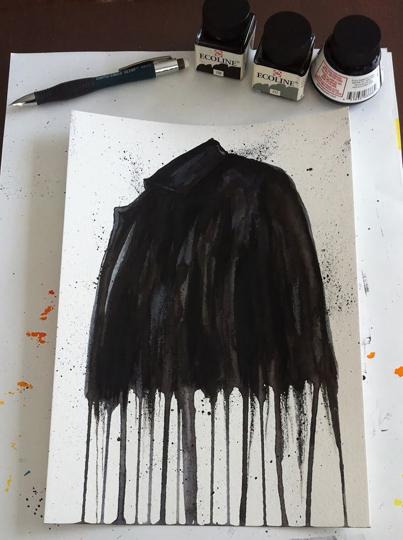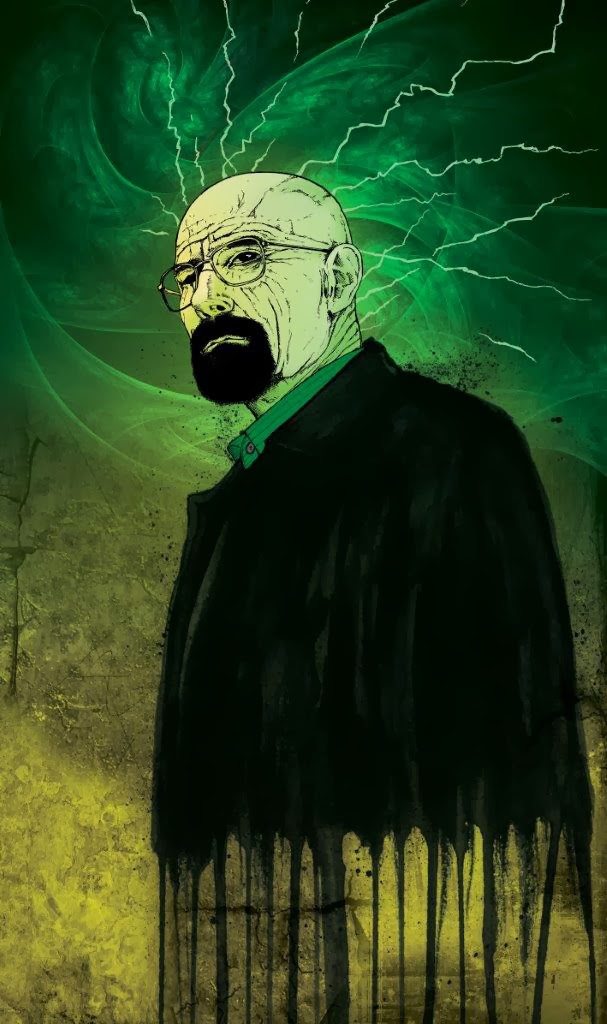
When JB Hi Fi announced a poster competition to commemorate the release of the final season on DVD and Blu-ray, it was with the same amount of passion that I took to designing some poster concepts. I spent about 3 days total working up designs and utilised a Facebook Draw-Off competition (see blog post here) as a warm up exercise, illustrating Walter White and to test some paint treatments that would be used in my poster designs.
The brief from the promoter was quite concise. I reviewed it several times to ensure that my work would remain within scope. An excert from the T&C is posted below for your easy reference;
TO BE ELIGIBLE FOR CONSIDERATION, EACH SUBMISSION MUST MEET ALL OF THE FOLLOWING CRITERIA:
a) The Poster must be the original work of the entrant, using the assets provided by the Promoter (which includes title treatment, approved key artwork, approved images);
b) The Poster must include the “Breaking Bad” title treatment as supplied;
c) The Poster must include the words “The Final Season”;
d) The Poster must clearly represent the “Breaking Bad” television series;
e) The Poster must not portray illicit/illegal drugs, drugs paraphernalia or actual drug use;
f) If the entrant’s Poster features any characters from “Breaking Bad” as featured in any supplied images, an image of Walter White (Bryan Cranston) from those supplied must also appear;
g) The Poster for Submission must be 685mm (wide) x 1010mm (high), CMYK, portrait orientation;
h) The Poster must be submitted as a flat JPEG image with a maximum file size of 2MB; and
i) The Winner must be able to submit high resolution (300dpi) artwork for printing.
The full T&C's for this competition can be read here.
After I had reviewed the scope of the competition and conditions of entry, I then set out to review the assets that were provided to entrants as outlined in points a) and b) above. I worked up a handful of quick thumbnail sketches keeping in mind the photos I had to work with and also to act as a guide as to what photos/imagery I would need to source and develop to compliment my poster designs.
 |
| Thumbnail sketches for poster design |
As the deadline for this competition fell after the air date of the final Breaking Bad episode, I decided that I would use the available time to develop poster design ideas and then revise my preferred designs after I had watched the final episode. This way I'd know how it all ended and I would have the big finale in mind to better convey the feel of the final season from a design aesthetic and marketable point of view. Plus I also didn't want to accidentally give away any key plot points to anyone that was waiting for the DVD / Blu-ray release to watch the final episodes.
The main theme that ran through this show was to my mind, being bad with clever science or the properties of change or even the changing state of decay. All brilliant poster design utilises a combination of 'hero' or main imagery PLUS the clever use of typography to convey the hook or headline to the intended audience. All poster and billboard design does this. It may be one simple image and a handful of words. Sometimes that's all it needs to be. That is the 'science' of great poster and billboard advertising. The themes or headlines that I developed to work with were as follows;
1. Balance the Equation
2. Every End Has A Start
3. All My Dreams Torn Asunder
4. Every Action Has An Equal And Opposite Reaction
5. Suffer The Consequences
6. The King is Dead - Long Live the King
1. Balance the Equation
2. Every End Has A Start
3. All My Dreams Torn Asunder
4. Every Action Has An Equal And Opposite Reaction
5. Suffer The Consequences
6. The King is Dead - Long Live the King
In total I spent somewhere close to 25 hours working on my poster design concepts. It was most definitely a labour of love and swan song to a show I hold so very dear. I produced nearly 40 poster designs and concepts but realised that these needed to be culled down to a manageable quantity so that I could focus my time on a handful of designs that I felt worked best.
The judging criteria for this design competition was a very simple and clear formula;
------------------------------------
JUDGING
A. First Round: Eligible Submissions received will be judged starting on or about 20th October 2013 by Promoter and representatives of JB Hi-Fi and/or Stack Magazine (“First Round Judges”), who will select at least eleven (11) finalists (“Finalists”), based upon the following criteria:
a) Marketability – 10 points;
b) Creativity – 10 points;
c) Originality – 10 points; and
d) Effective use of content – 10 points
(40 points maximum)
The eleven (11) entrants whose Submissions receive the highest point totals will be declared Finalists, and will have their Submissions entered into the Final Round Judging, subject to verification of eligibility. Promoter has the right, in its sole discretion, to select fewer than ten (11) Finalists based on insufficient number of eligible Entries/Submissions received. In the event of a tie to determine a Finalist, the tied entrant who submitted the Submission with the higher score in “Marketability” will be declared a potential Finalist. In the event of a further tie, the tied entrant who submitted the Submission with the higher score in “Creativity” will be declared a potential Finalist. Any further ties will be broken by the points earned by remaining tied entrants respectively in each of the following categories, in order, as necessary: “Originality” and “Effective use of content provided by Promoter”. If needed, the First Round Judges will re-score Submissions until any tie(s) is/are broken.
------------------------------------
The above states that Marketability is the most important criterion followed by Creativity, Originality and then followed by Effective Use of Content (promoter supplied assets). It was with this in mind that I produced the following 15 Final Poster Design submissions from my initial design concepts.
The above states that Marketability is the most important criterion followed by Creativity, Originality and then followed by Effective Use of Content (promoter supplied assets). It was with this in mind that I produced the following 15 Final Poster Design submissions from my initial design concepts.
 |
| Design 1. Straight Up Character Poster with Headline. We have the rival families 'divided' by Jesse Pinkman. |
 |
| Design 2. Straight Up Character Poster with Headline. Same as above but with different colour/text treatment. |
 |
| Design 3. Characters in Silhouette against a setting sun with headline. In this version, I've changed the natural red colour scheme to the trademark Breaking Bad green. I quite like this design. The characters being in silhouette convey a sense that no one is safe in the final episodes. As the sun sets on our cast of characters so does it set on the final season of Breaking Bad. |
 |
| Design 4. Characters in Silhouette against a setting sun with headline. The characters being in silhouette convey a sense that no one is safe in the final episodes. As the sun sets on our cast of characters so does it set on the final season of Breaking Bad. Note the placement of Heisenberg's hat on the cactus next to Walter White. This was to serve as a visual cue as to who this character is in the poster design plus it acts as a nod to Walter White wanting to retire the Heisenberg role so that he may reunite his family. |
 |
| Design 5. This poster design places Jesse and Walt's relationship front and centre in an attempt to convey what is going on between these two characters during the final season. Jesse fears Walt and what he may do to him, whereas Walt is concerned about Jesse's intent and what he may do with the knowledge he has. Walt feels tremendous responsibility to this young man and in many ways is much closer to Jesse than he is to his own son. It's up to Walter to put things right and balance the equation before all is said and done. |
 |
| Design 6. The main theme for this design is Skyler looking at Walt to see if there's any semblance of the man left that she used to know but still loves. Walt, as usual, is looking away from his family to what he thinks he 'needs' to do for his them. The headline reads "All My Dreams Torn Asunder" but whose dreams does it refer to? |
 |
| Design 7. The King Is Dead - Long Live The King. |
 |
| Design 8. The King Is Dead - Long Live The King. Alternate version without the Heisenberg hat. I felt that this concept was a bit risky as it says that the King is Dead which when taken literally announces that Walter White is dead. Everyone that followed the show always knew that the series was going to end with the death of Walter White - the tantalising question was - how is he going to die? |
 |
| Design 9. Straight up hero image with headline. This is an early final season promo photo that includes Mike. I thought this was a nice touch and works if this design is used for the entire final season and not just the final 8 episodes. This is one of my favourite designs but probably not appropriate for this design competition. |
 |
| Design 10. Walter White hero image with paint splatter treatment and headline. The composition of this poster is good. The colour scheme however is not appropriate for the final season which has a very dark tone running throughout. This would work much better if the blue sky was a dark sky with setting sun. |
 |
| Design 11. Simple design and message but has the same problem as the poster design above it. Needs to be darker/more gritty and inline with the feel of those final 8 episodes. |
 |
| Design 12. Long Live The King. |
 |
| Design 13. Long Live The King - Heisenberg version. |
 |
| Design 14. All My Dreams Torn Asunder - Walter White decaying/fading image that symbolises the way he loses control of many situations in the episodes leading up to the finale. His mind is succumbing to the presure and recurring cancer and the greedy hounds of war he's let loose in the form of the white supremacists gang. |
 |
| Design 15. A split image of Walter White from the first and last seasons of the show - a symbolic gesture of the transformation of Walter White into Heisenberg. |
I can see now that some of these designs (1, 2, 6, 10 and 11) don't quite hit the mark or reflect that dark tone that was prevalent throughout the last season of Breaking Bad but I thought that some of these designs were fairly strong.
None of my designs were selected by the judging panel to make the finalists selection. I guess they just weren't what the judges were looking for in this instance and that's how it goes when entering a design based competition. Here's a link to the winning design and 10 finalists.
I'd love to know what Vince Gilligan would have thought of my designs if he had seen them but I guess I'll never know. As always your thoughts and comments are most welcome.
Damian K. Sheiles